WORLD IS ONE
A quiet bloom
A lotus held in a fine circle. A quiet bloom, with room for a world of feeling.
The familiar lotus keeps its shape: laterite petals and rings, with warm straw accents against cream. Sea blue gives the surrounding website its cool counterpoint.
Earth, sea and a little warmth
The palette follows Ahimanikya’s reference to Odisha’s natural materials: ମାଙ୍କଡ଼ା ପଥର, ନୀଳ ସାଗର and ଶୁଖା ଘଷି.
| Colour | Value | Role |
|---|---|---|
| Laterite | #98452F | Petal lines, poetic emphasis and links |
| Sea | #195565 | Navigation, player and actions |
| Warm straw | #C69B52 | Petal accents and quiet decoration |
| Paper | #F7F0E3 | Reading background |
| Ink | #233C40 | Headings and body text |
| Warm white | #FFFCF5 | Light surfaces and paper highlights |
| Muted ink | #62665F | Secondary descriptions |
| Fine line | #DCD1BE | Dividers and quiet boundaries |
The listening colours
| Colour | Value | Role |
|---|---|---|
| Soft sea | #467886 | Unplayed progress track and player border |
| Mist | #C3D4D7 | Secondary text on the sea-blue player |
| Light gold | #E8C58A | Active player controls and playing indicator |
The frame colours
| Colour | Value | Role |
|---|---|---|
| Walnut | #604431 | Wooden frame |
| Warm wood | #997253 | Frame highlights |
| Deep wood | #35271E | Frame shadow |
| Linen | #E6DCC5 | Woven-cloth inset |
| Antique gold | #AA9876 | Fine inner frame edge |
These are the base colours. Paper grain, wood grain, cloth and soft light use subtle transparent layers; the artwork retains its own background and colour. Straw and fine-line colours are decorative, not colours for small text on paper.
Assets to carry the feeling
Download the complete brand kit — ZIP
- Colour logo
- Single-colour logo
- Wordmark
- Square icon
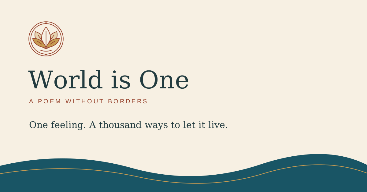
- Social card — editable SVG
- Colour values — JSON
- Usage notes
- Flowing thread and star
- Leaf border
- Palm-leaf manuscript
The SVGs scale without losing sharpness. The social card is 1200 × 630; export it as a PNG for social platforms. The wordmark uses live Georgia and Arial type; outline the text in a design editor when exact reproduction matters.
A quiet place to stay
A little paper grain. A fine line like an engraving. A frame that gives an image room to breathe. The site should feel welcoming even when you stop reading and simply listen. The heritage detail stays at the edges; the poem and artwork keep the centre.
Where the details belong
| Page | Artistic touch |
|---|---|
| Home | Lotus identity, flowing thread at the story transition, a quiet star beside the poem |
| Language pages | Palm-leaf reading detail and one flowing thread after the poem; sea-blue listening controls |
| Original poem | Palm-leaf manuscript beside the heading, flowing thread after the poem |
| Art Journal and artwork pages | Wooden frames, woven cloth, soft gallery light; a wave at the journal’s closing |
| Language directory, guides and contribution page | One small leaf detail beneath the main heading |
| Recording pages | Shared paper, lotus and border; the player remains the focus |
Use one ornament at a pause, not behind words or over art. Keep decorative details still and outside keyboard navigation. Leave working areas such as lyric timing tools clear. These are contemporary motifs inspired by Odisha’s visual traditions; their sources are described in Design roots and credits.
Give the work room
Keep the mark’s proportions and leave clear space around it. Let paper and ink do most of the work; use laterite sparingly and straw for decoration, not small text. Headlines use Georgia; navigation and body copy use a simple system font with native-script fallbacks.
The palette belongs to the website. The artwork keeps its own colours, texture and strokes.
The original lotus seal remains the collection’s mark. Its fine lines belong with the site’s manuscript details, poetic typography and framed art. Design roots and credits · Reuse terms